HYPHAENETIC
CATEGORY
Transmedia installation
DETAILS
Hyphaenetic is an exhibit designed for the Museum at FIT featuring designers who use innovative technology in their work and create pieces that, in they own way, address the state of the world today. The exhibition design includes installation design, transmedia branding, and a custom typeface. Overall, Hyphaenetic’s branding communicates the installation’s future-focused contest and technology-driven focus.
→
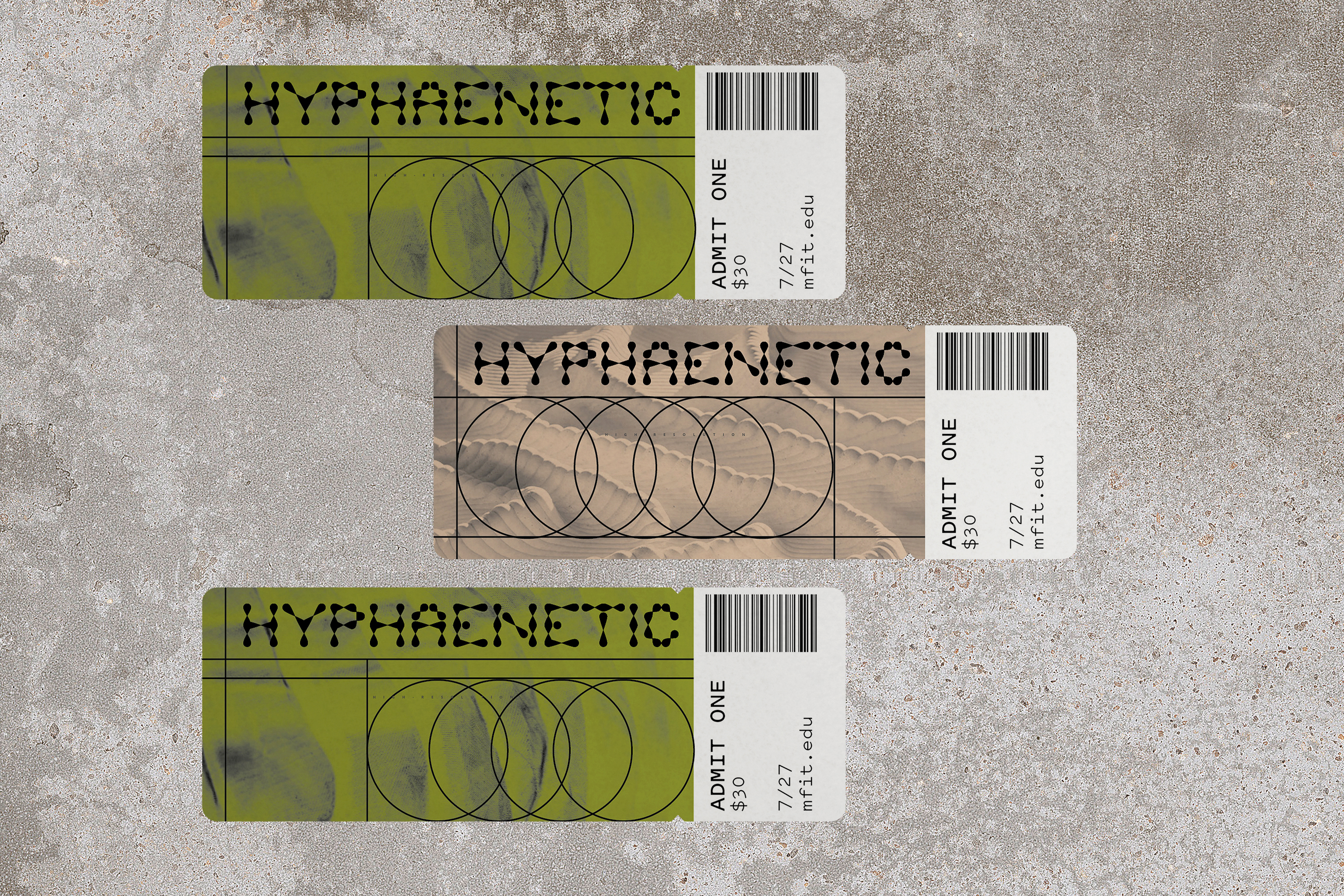
The installation tickets draw inspiration from the visual imagery of pattern-making and jacquard loom punch cards.
→
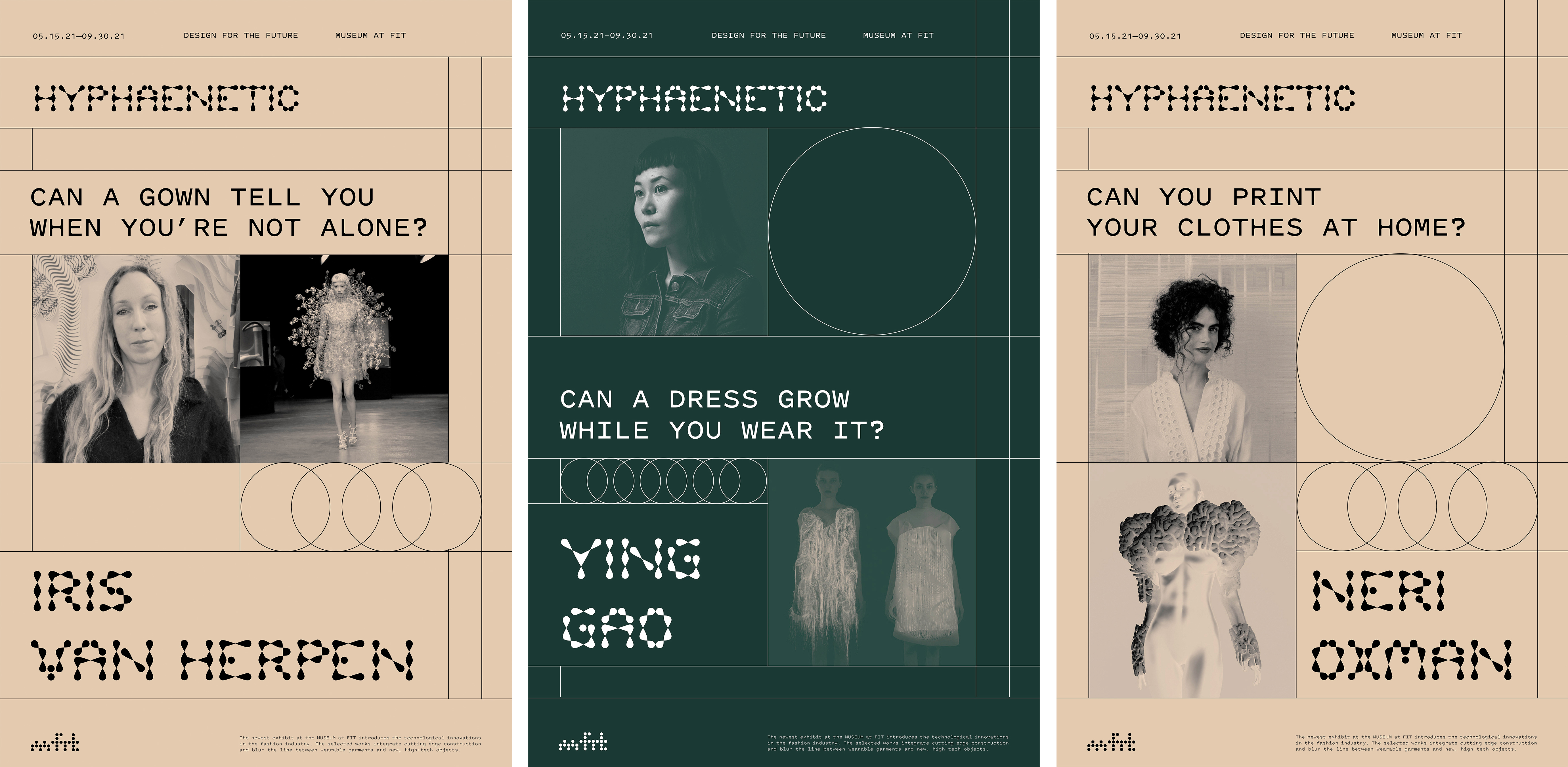
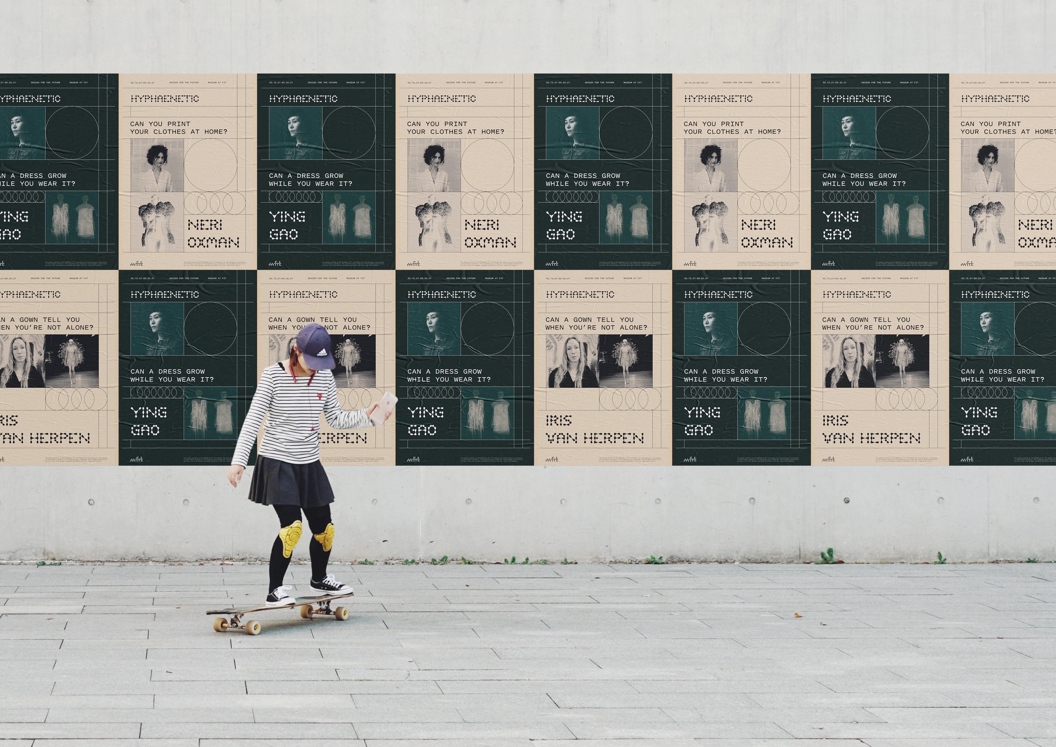
The posters for the exhibition test the identity in terms of scale, contrast, and imagery. Designing the posters helped establish distinguishing visual identity elements, such as lines inspired by pattern-making and duo-tone imagery.
The posters for the exhibition test the identity in terms of scale, contrast, and imagery. Designing the posters helped establish distinguishing visual identity elements, such as lines inspired by pattern-making and duo-tone imagery.
→
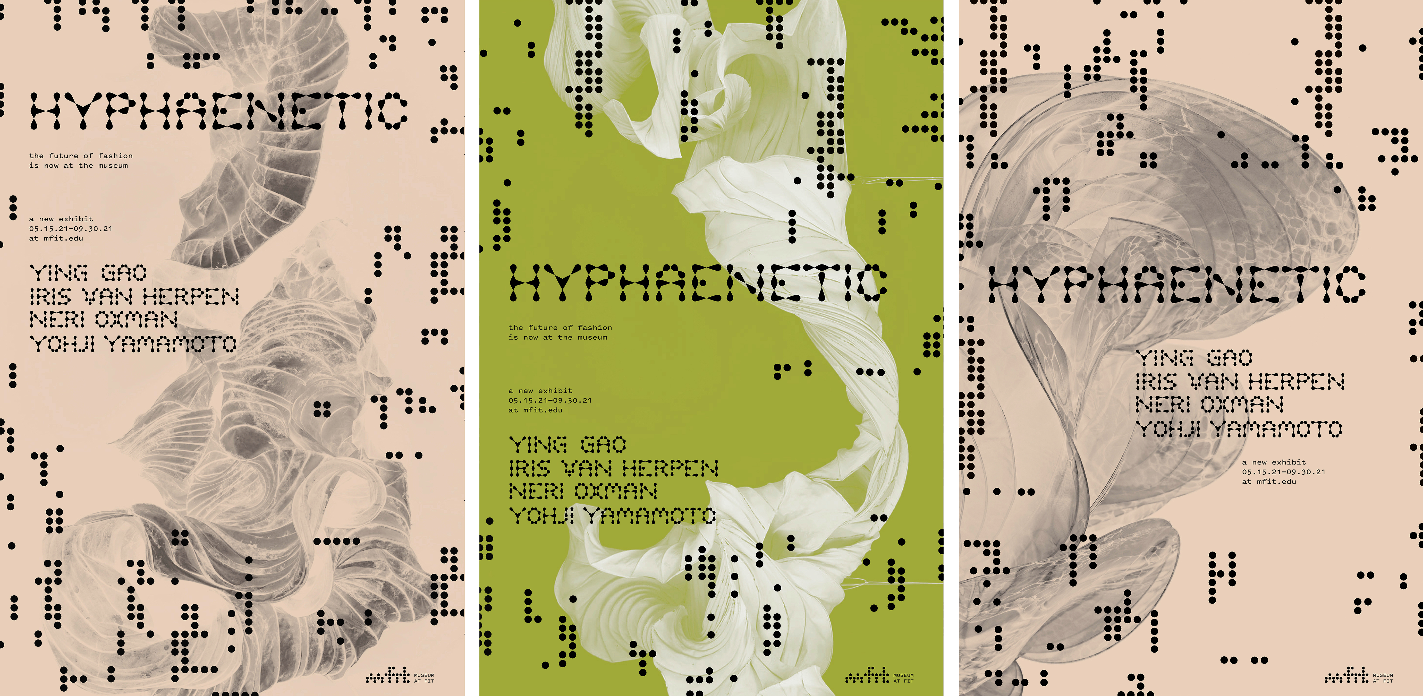
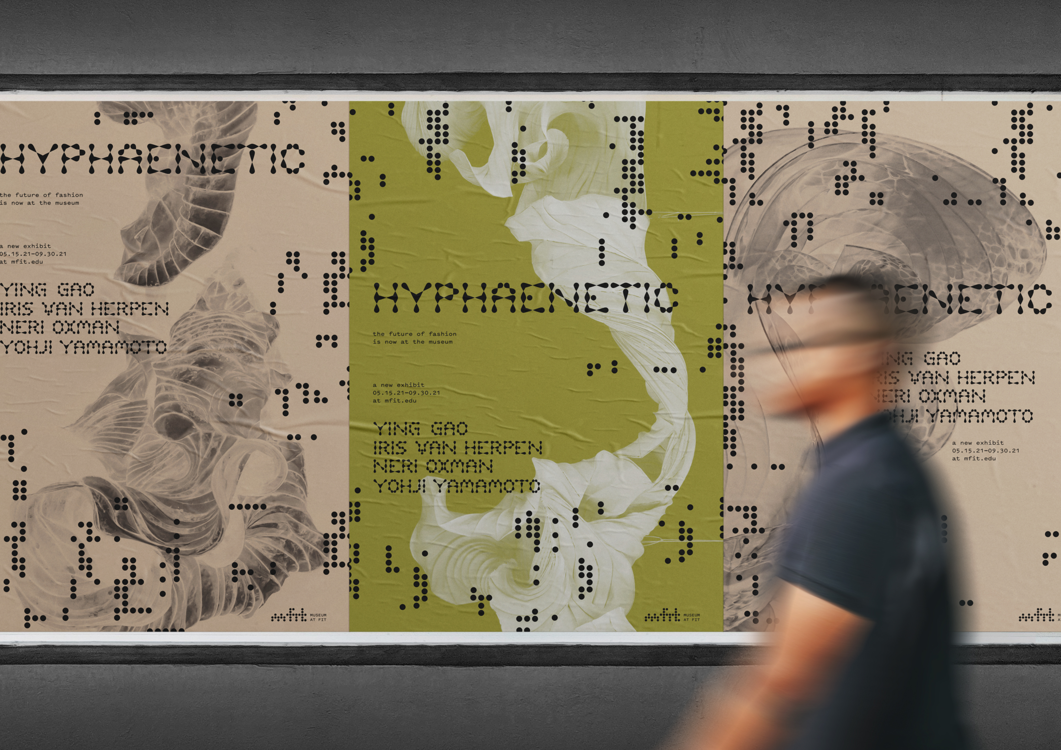
I flattened the color palettes of the posters to allow the designer's diverse styles of work to be shown together without clashing. Additionally, this move put the focus on the form of the garments, highlighting their other-worldly look.
I flattened the color palettes of the posters to allow the designer's diverse styles of work to be shown together without clashing. Additionally, this move put the focus on the form of the garments, highlighting their other-worldly look.
→
Information-based posters show the events that accompany the exhibition, along with duo-tone imagery.
Information-based posters show the events that accompany the exhibition, along with duo-tone imagery.


→
These posters allowed me to test the identity with type at a granular scale.
These posters allowed me to test the identity with type at a granular scale.

→
Designing these calendar-style posters established the use of graphic elements, like lines and imagery, to create informational hierarchies within informational materials.
Designing these calendar-style posters established the use of graphic elements, like lines and imagery, to create informational hierarchies within informational materials.

→
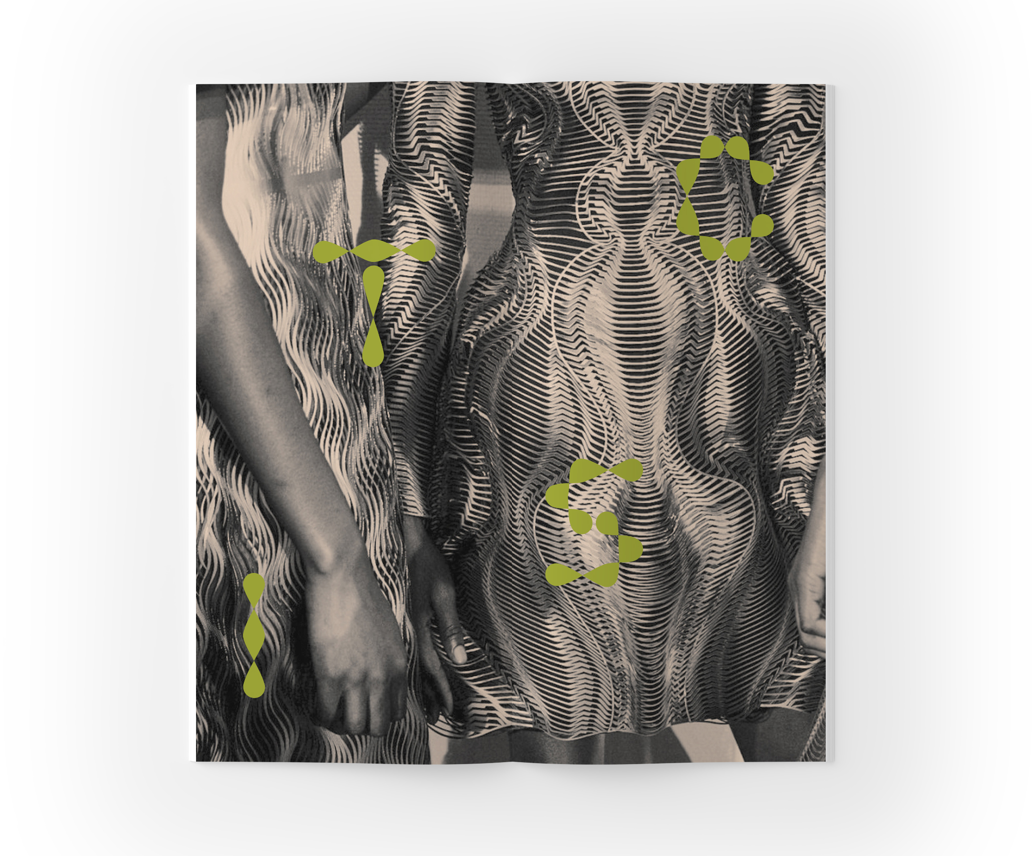
An alternate series of posters contrasts the institutional typeface with dots arranged in haphazard patterns to create an organic feel.
An alternate series of posters contrasts the institutional typeface with dots arranged in haphazard patterns to create an organic feel.
→
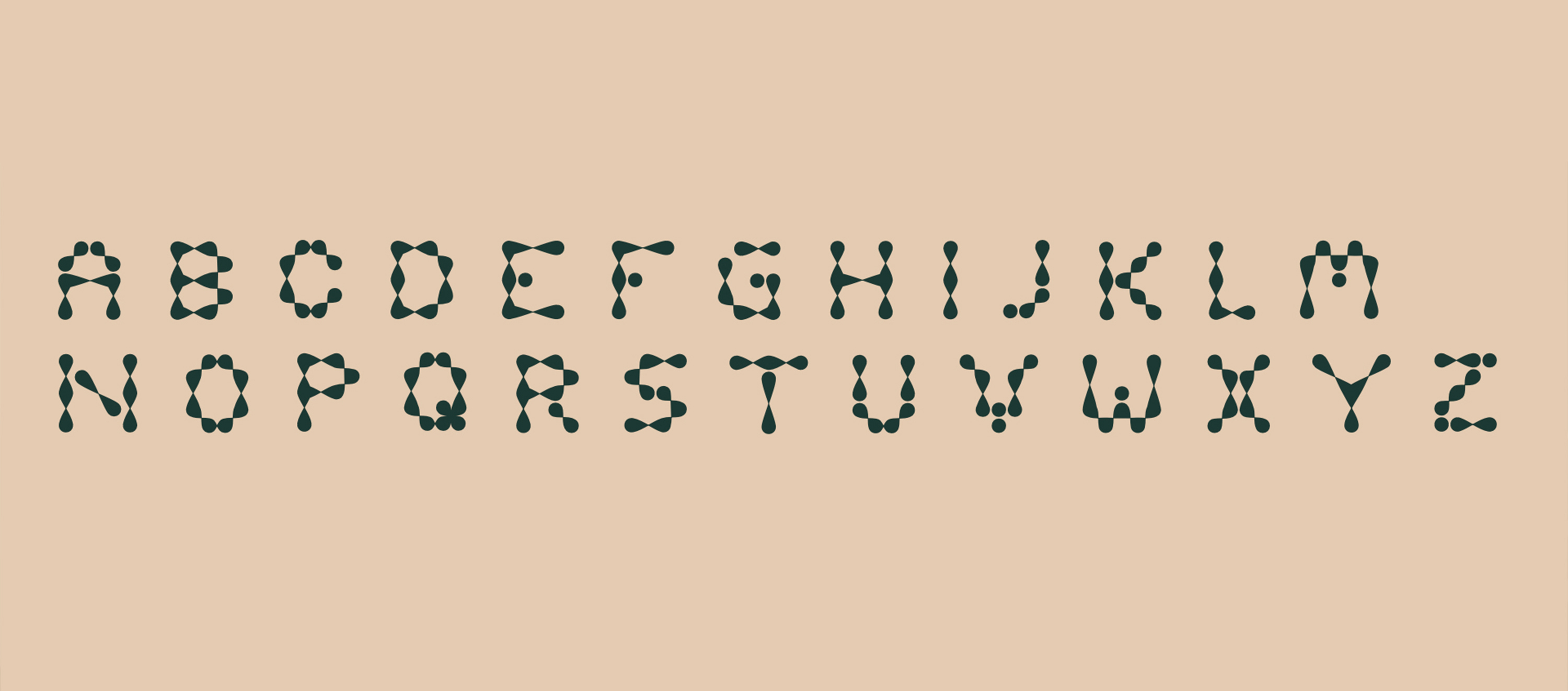
The dot-based pattern was inspired by jacquard loom punch cards.
The dot-based pattern was inspired by jacquard loom punch cards.
→
Designing a custom typeface allowed me to connect the dot-motif from the posters to the technological focus of the identity design. Connecting the dots with angular shapes created a typeface that feels both organic and high-tech.
Designing a custom typeface allowed me to connect the dot-motif from the posters to the technological focus of the identity design. Connecting the dots with angular shapes created a typeface that feels both organic and high-tech.
→
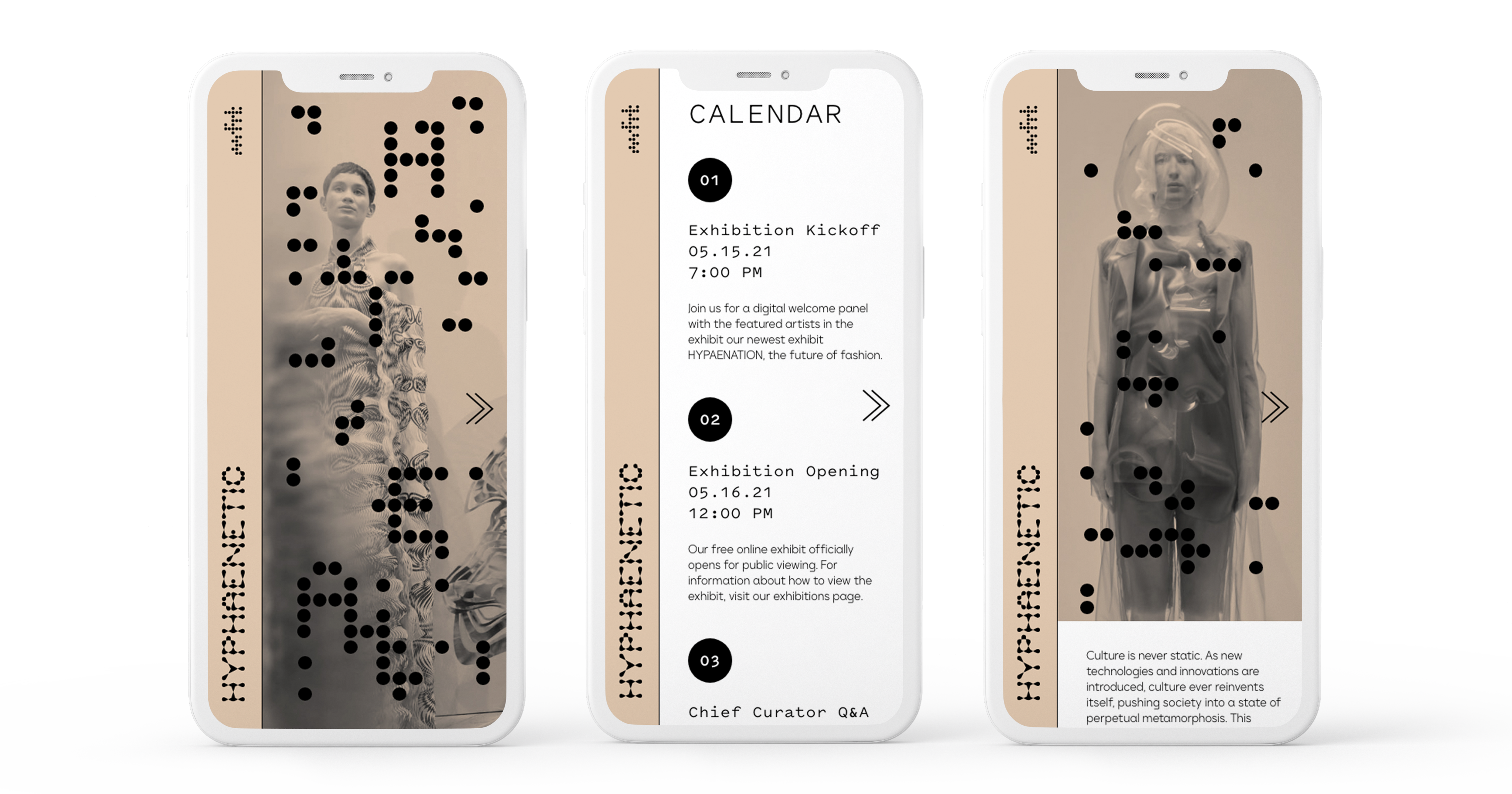
I designed the website with a horizontal scroll to evoke the folding of the fabric. Dotted image screens hide easter eggs with facts or quotes from the designers.
I designed the website with a horizontal scroll to evoke the folding of the fabric. Dotted image screens hide easter eggs with facts or quotes from the designers.
→
Both the mobile and desktop website utilizes a flattened color palette and randomized dots to create a unique, easily navigable experience.
Both the mobile and desktop website utilizes a flattened color palette and randomized dots to create a unique, easily navigable experience.
→
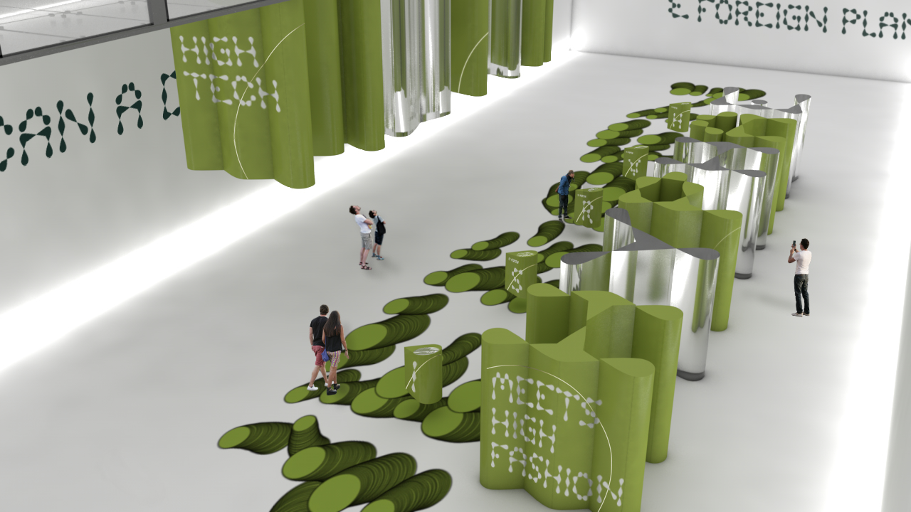
Outside the installation, forms created by extruding the base elements of the custom typeface emerge from the ground.
Outside the installation, forms created by extruding the base elements of the custom typeface emerge from the ground.

→
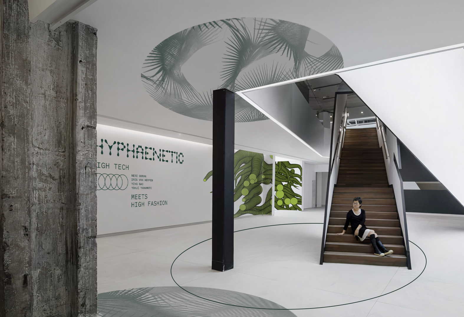
The title wall unites the 2-D elements of the identity with the 3-D exhibit. The wall text juxtaposes the processing-based imagery that emerges from within the installation space.
The title wall unites the 2-D elements of the identity with the 3-D exhibit. The wall text juxtaposes the processing-based imagery that emerges from within the installation space.
→
The typeforms I designed are used as large-scale physical exhibition spaces. Within the installation, the vistor gets to walk through a dimensional, extruded font.
The typeforms I designed are used as large-scale physical exhibition spaces. Within the installation, the vistor gets to walk through a dimensional, extruded font.

→Inside the installation, the custom typeface is used as a form for type, as well as a container for the featured garments.
→The floor functions as a screen, which shows the name of the designer whose work is show in the respective section of the installation.
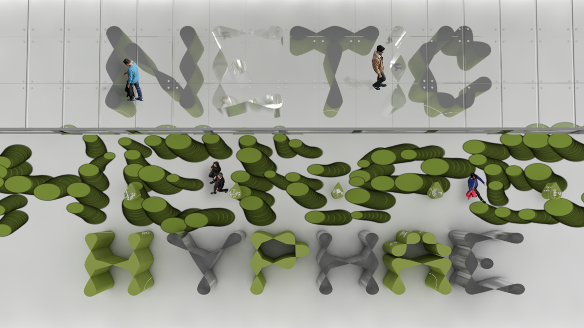
→At eye-level, visitors can see the name of the designer at a smaller scale, as well as vital information about the technology they use.

→
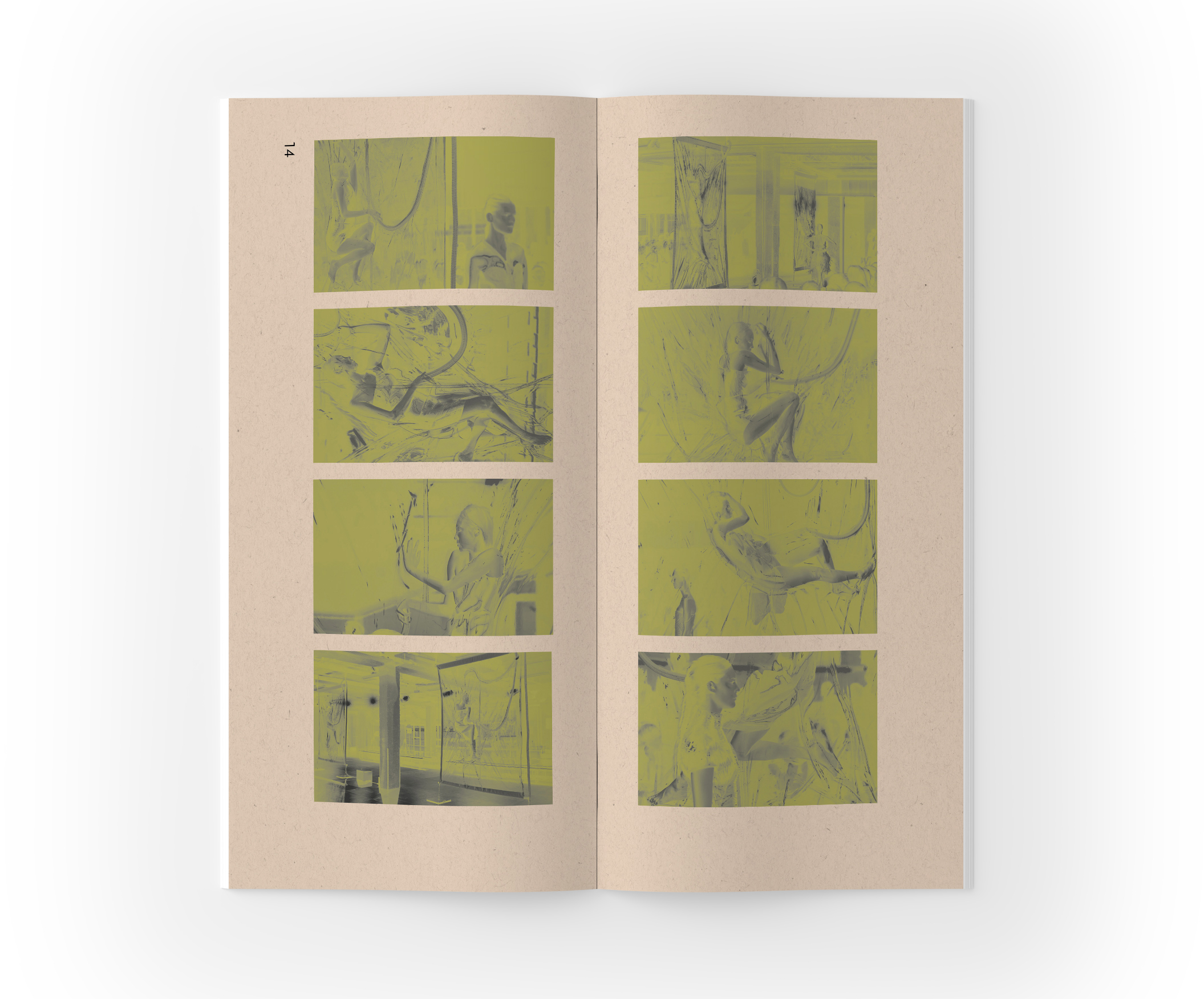
As visitors leave the installation, the project narrative continues in "A Guide to Wearable Tech," a booklet that explores how the technology used to make the garments on display can help build a better future.

→
I flattened the color palette throughout the spreads to evoke the colors of the exhibit.
Click on each spread for a closer view ☺
I flattened the color palette throughout the spreads to evoke the colors of the exhibit.
Click on each spread for a closer view ☺